
An energetic web development company needed a trustworthy rebrand.
I designed a clean and punchy brand for BFC Support to relay the new company ethos of providing experienced and approachable website support for the masses.


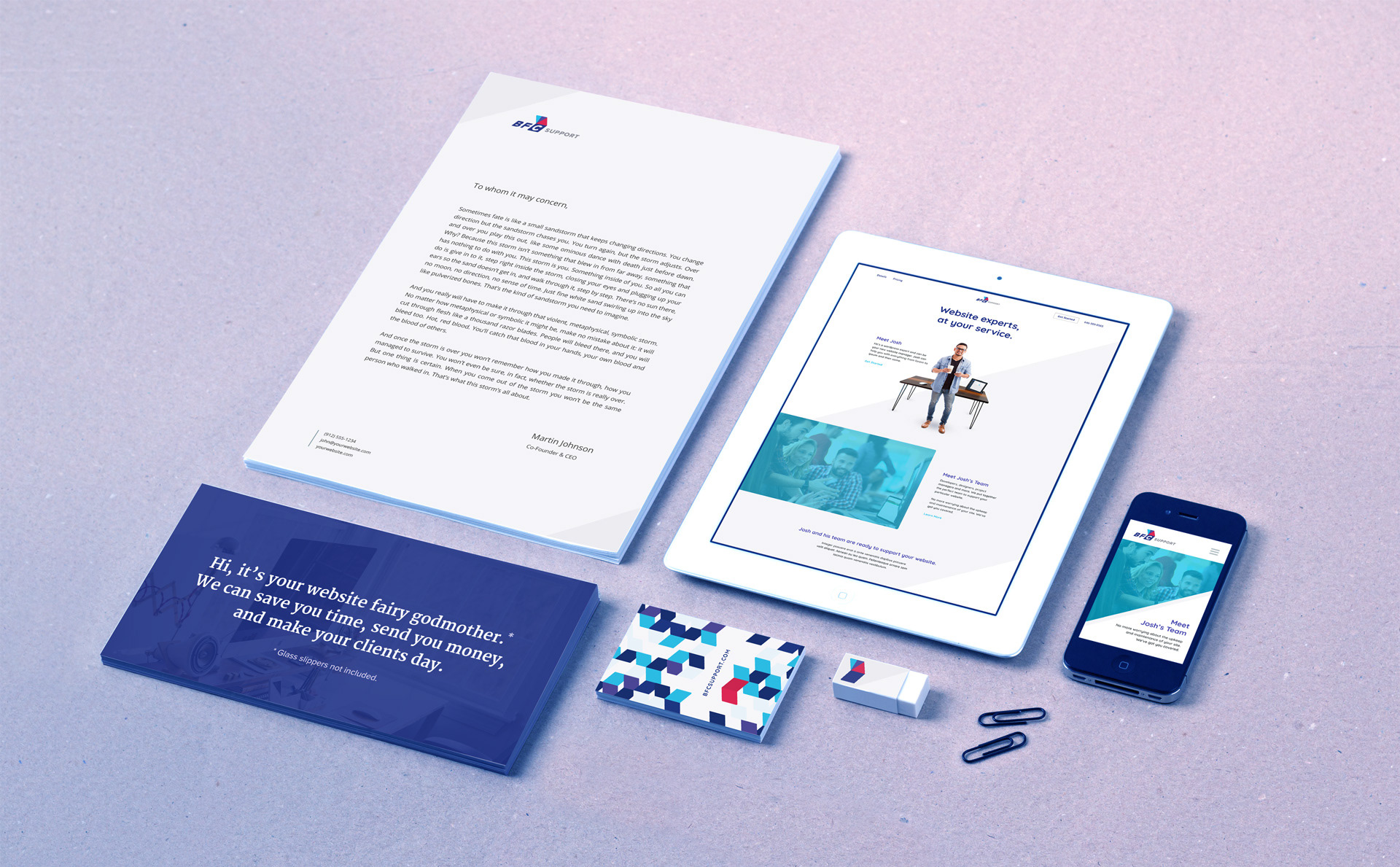
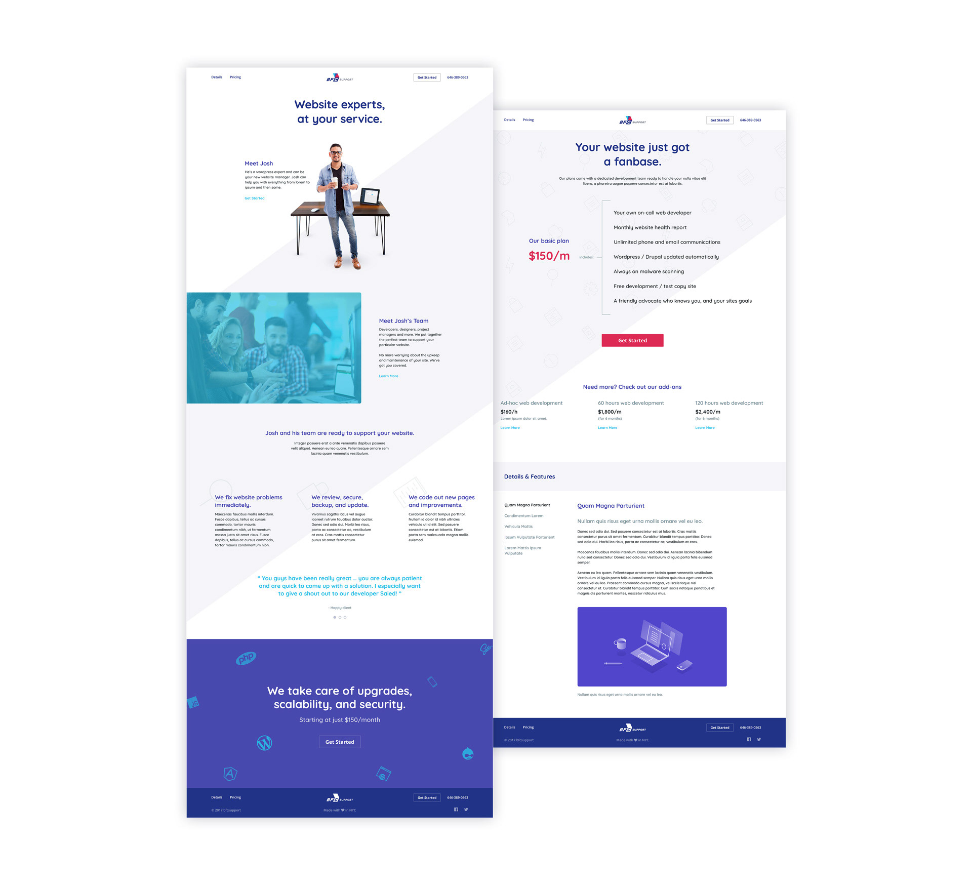
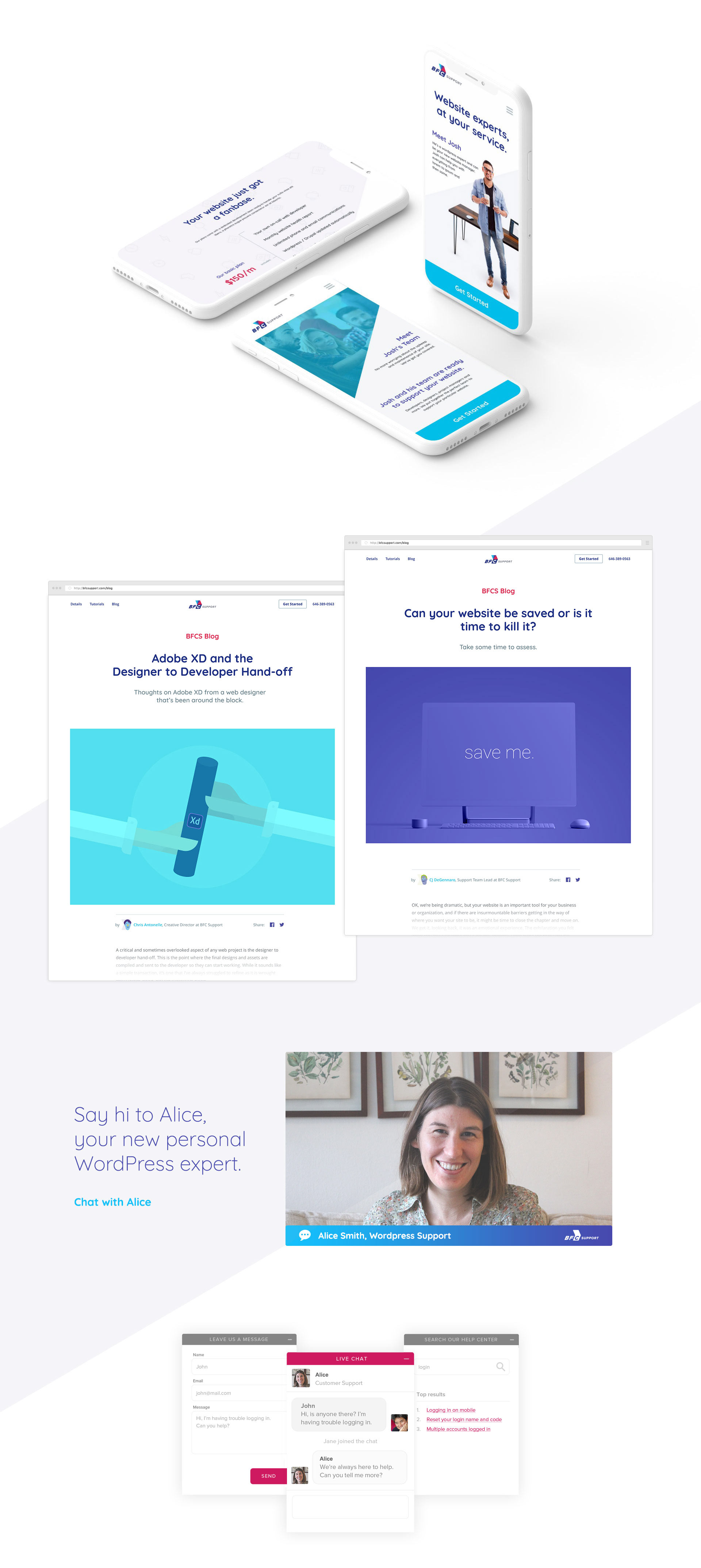
The Website
The approach for the website included minimal layouts, angular graphics, and clear, direct messaging. I also wanted to make sure users knew that real humans were on the other end, caring for and maintaining their websites. This was mainly achieved by using actual staff photos as opposed to stock, content specific client testimonials, and implementing a more relaxed, natural tone of voice for all written copy.
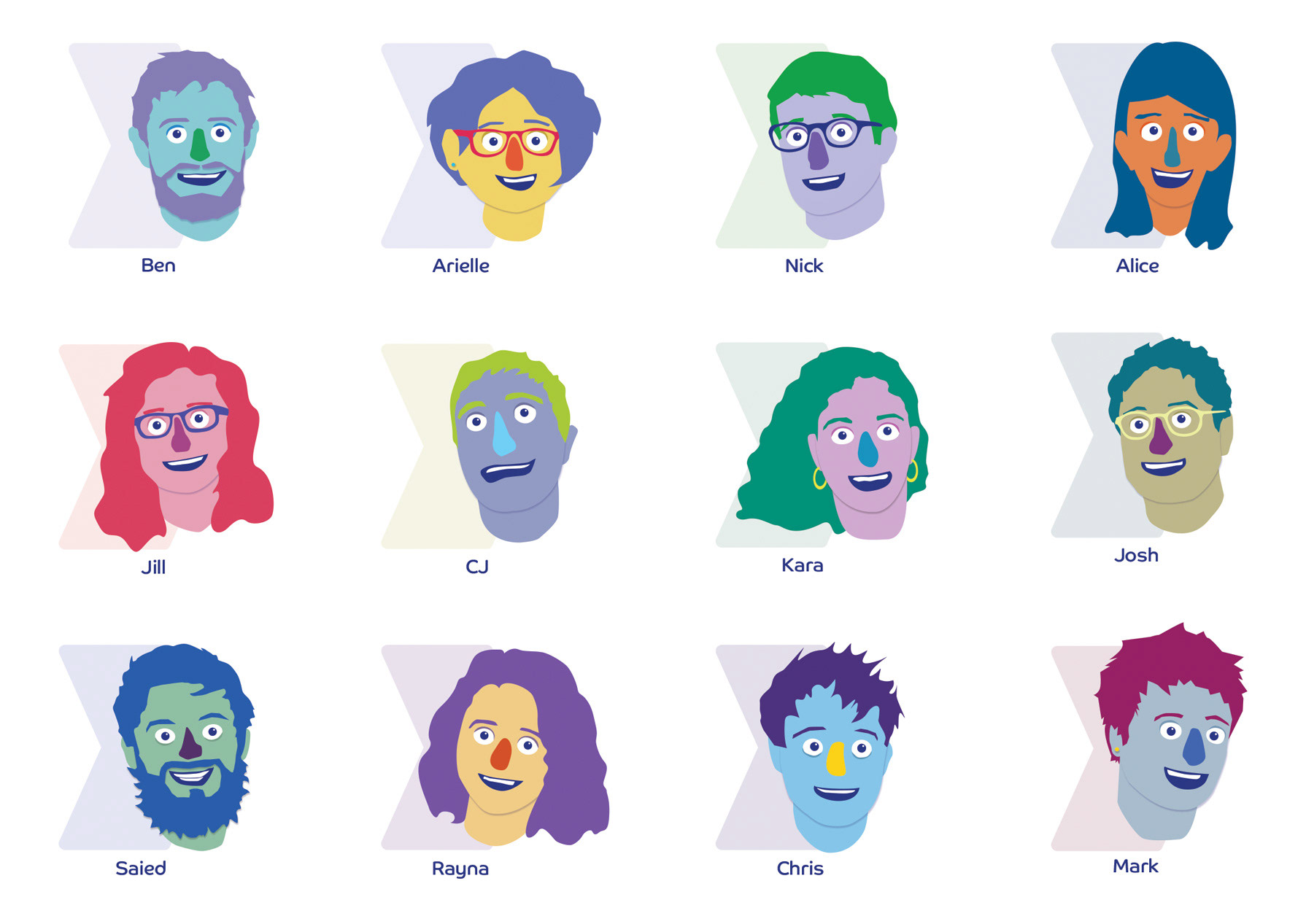
Custom Icons & Staff Illustrations
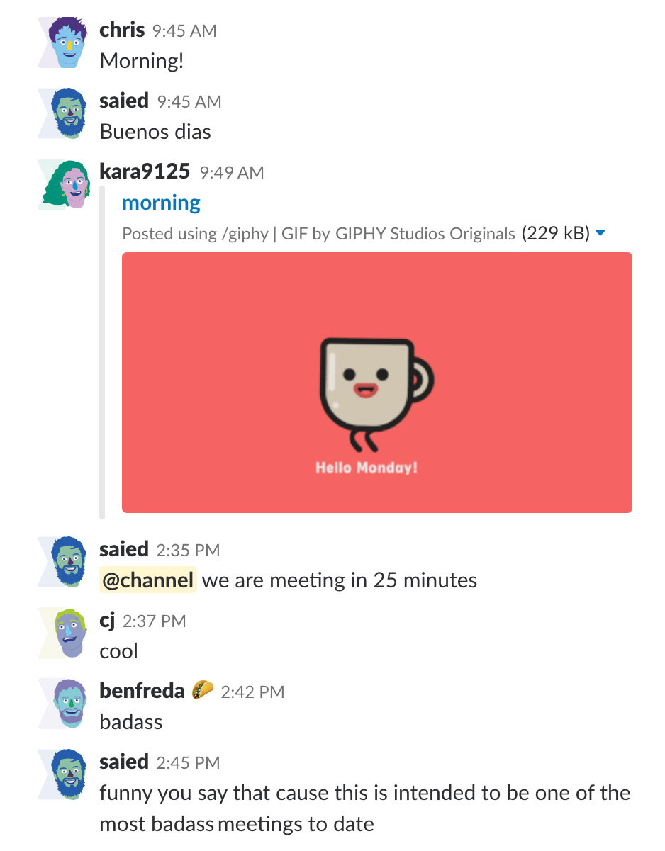
In addition to a versatile set of custom icons, I created a series of staff 'muppet' illustrations. These were super fun to make and a big hit with the crew. They added a bit of personality and a fun vibe to the company and were used on the site as well as internal team management services.


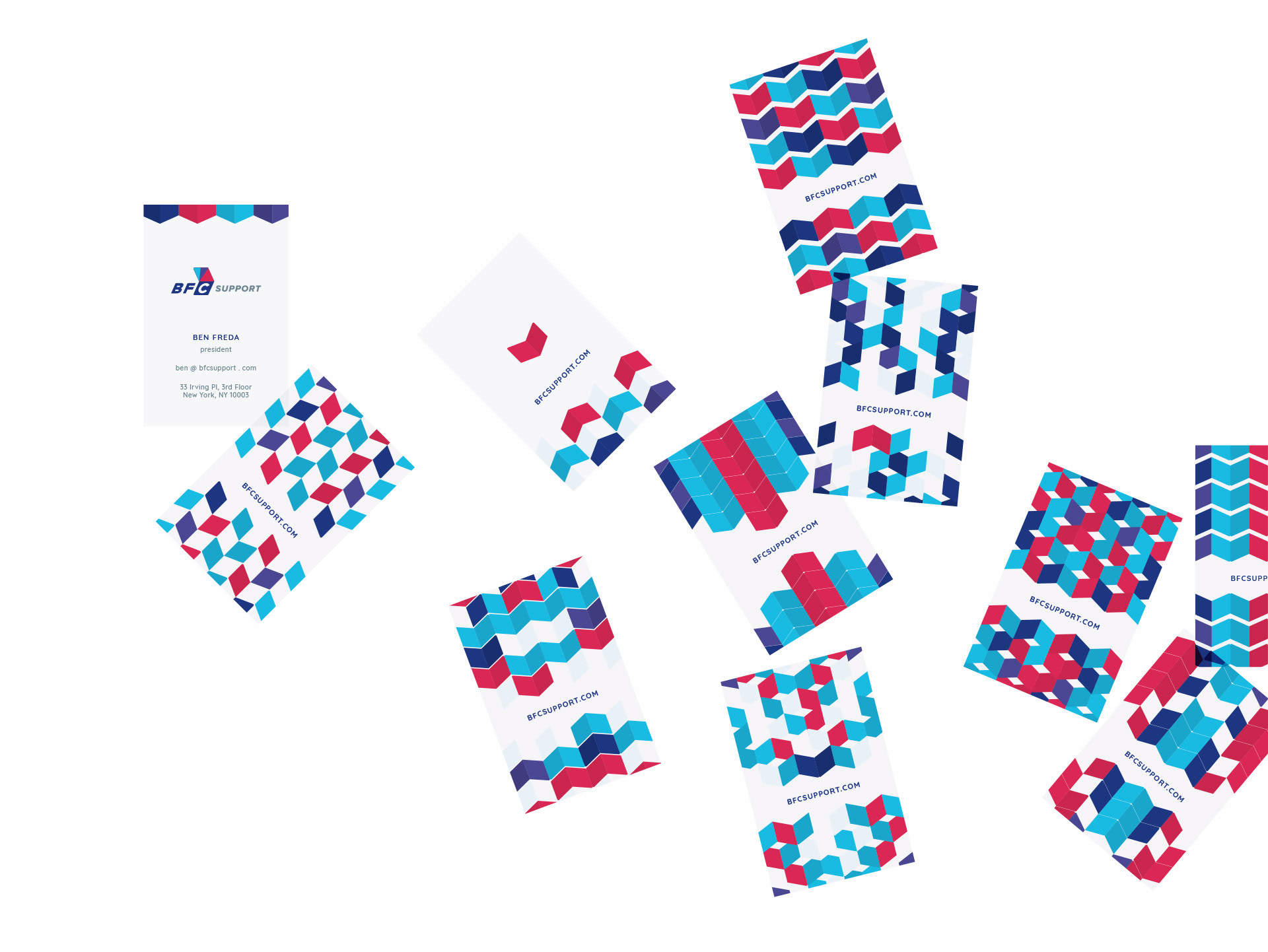
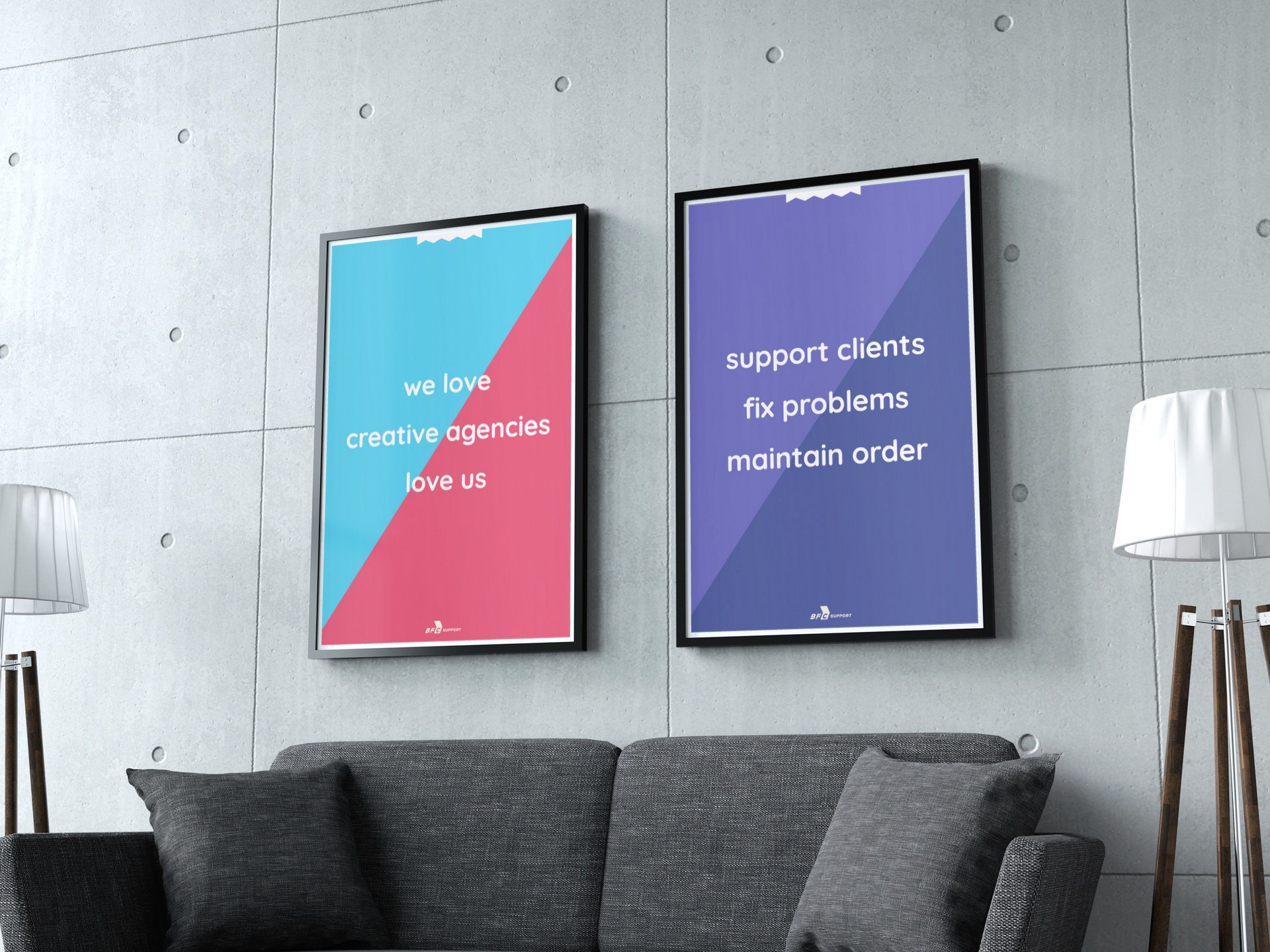
Brand Collateral
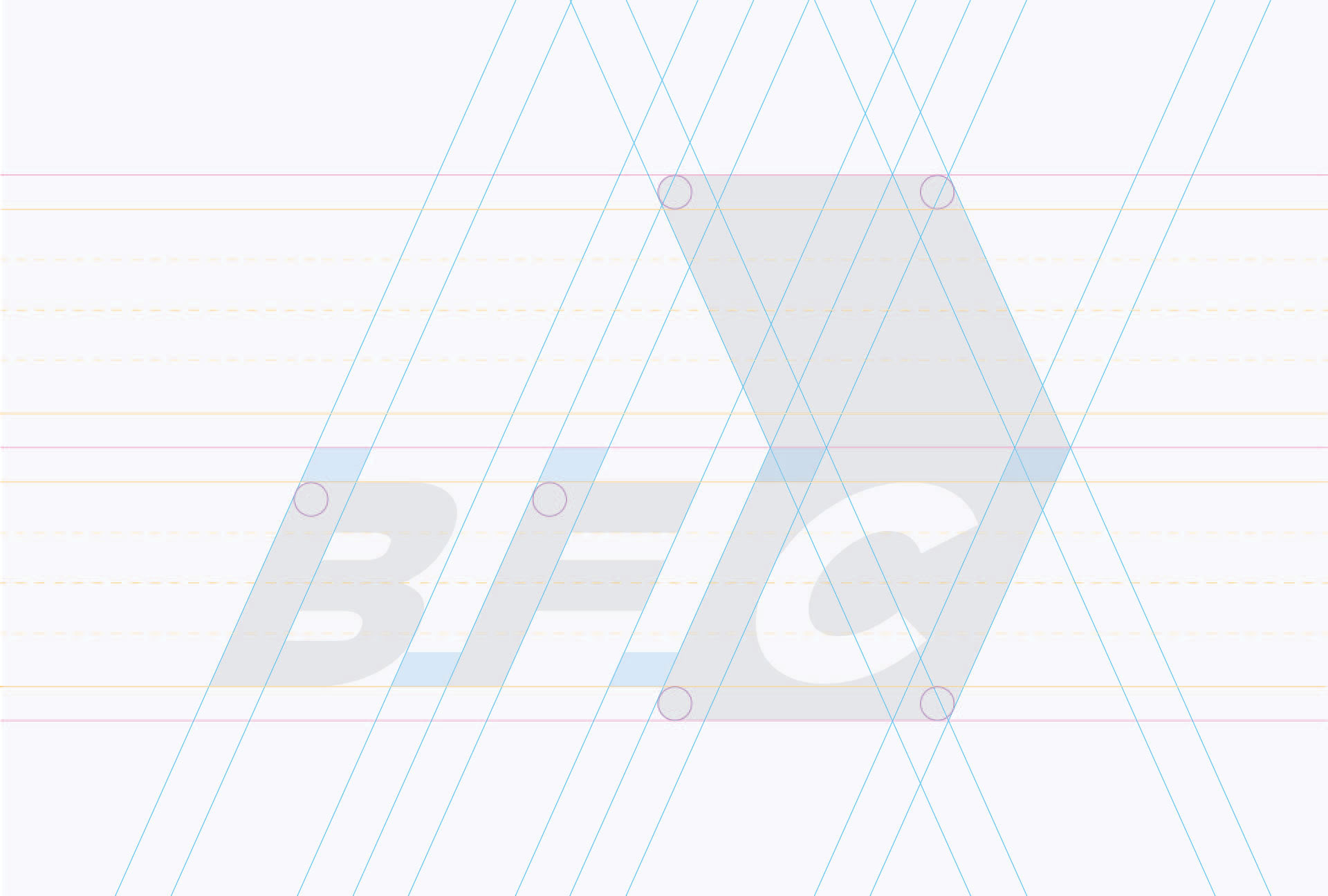
I created a series of geometric patterns around the chevron (html bracket) shape that was utilized for business cards, stickers, posters and more.