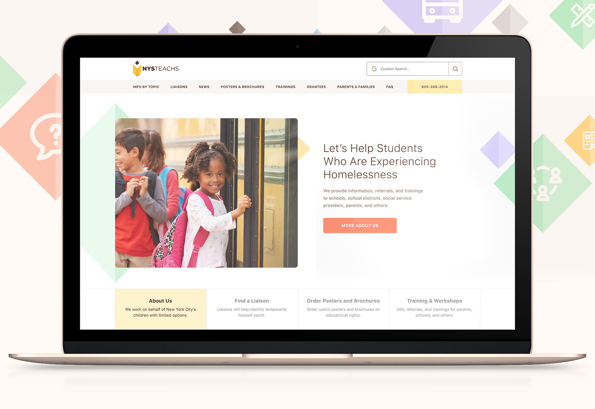
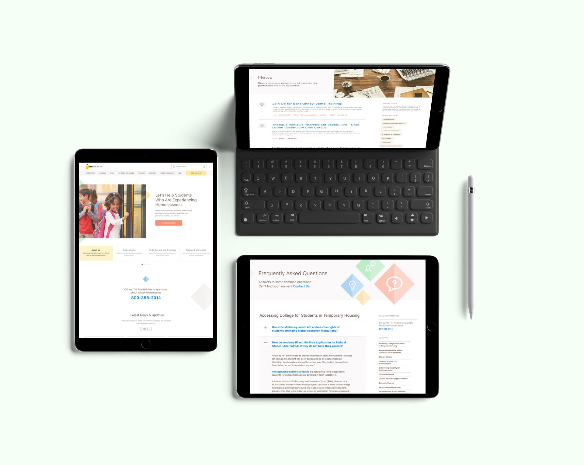
Redesigning a resource hub for the education of homeless students.
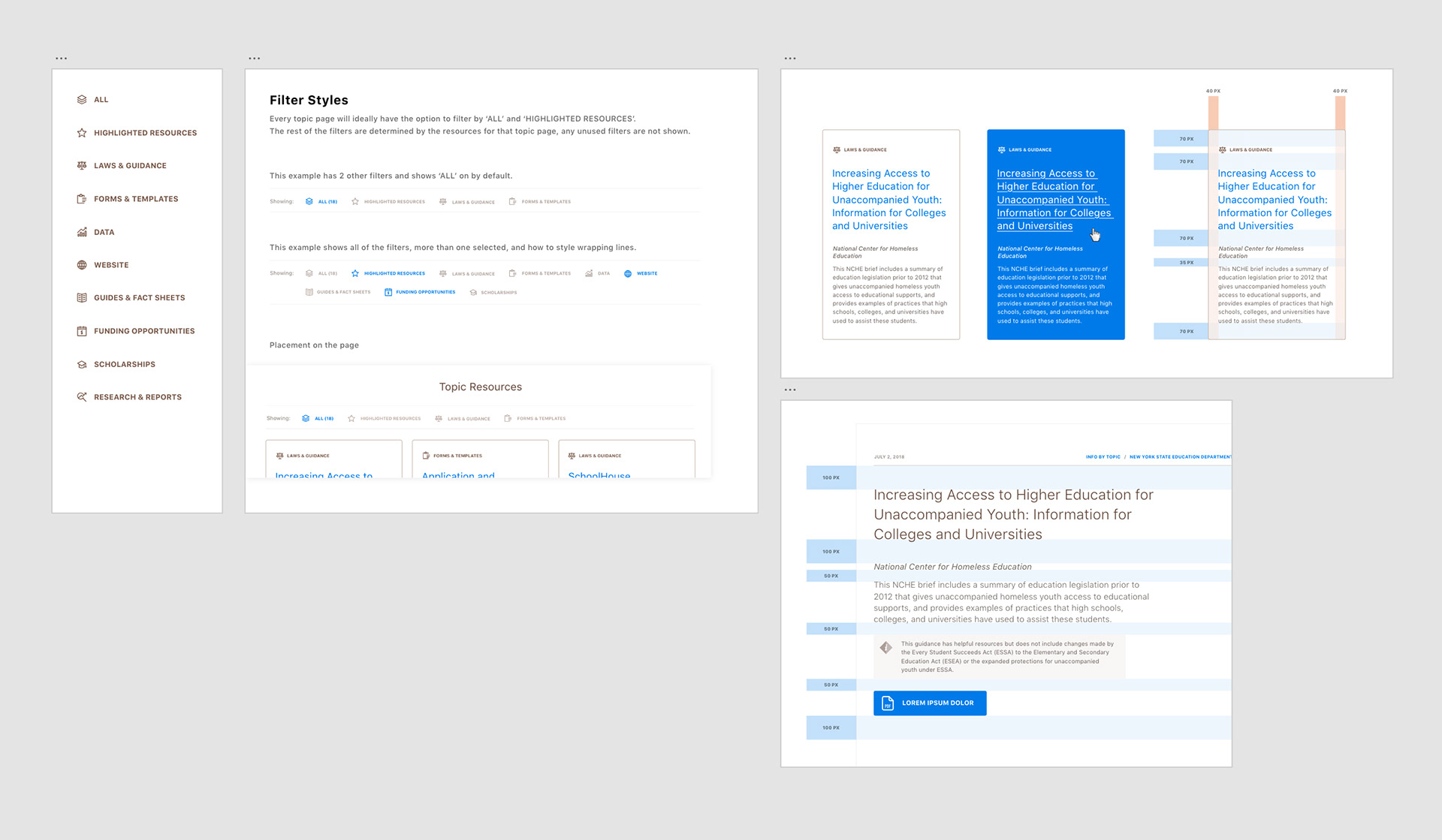
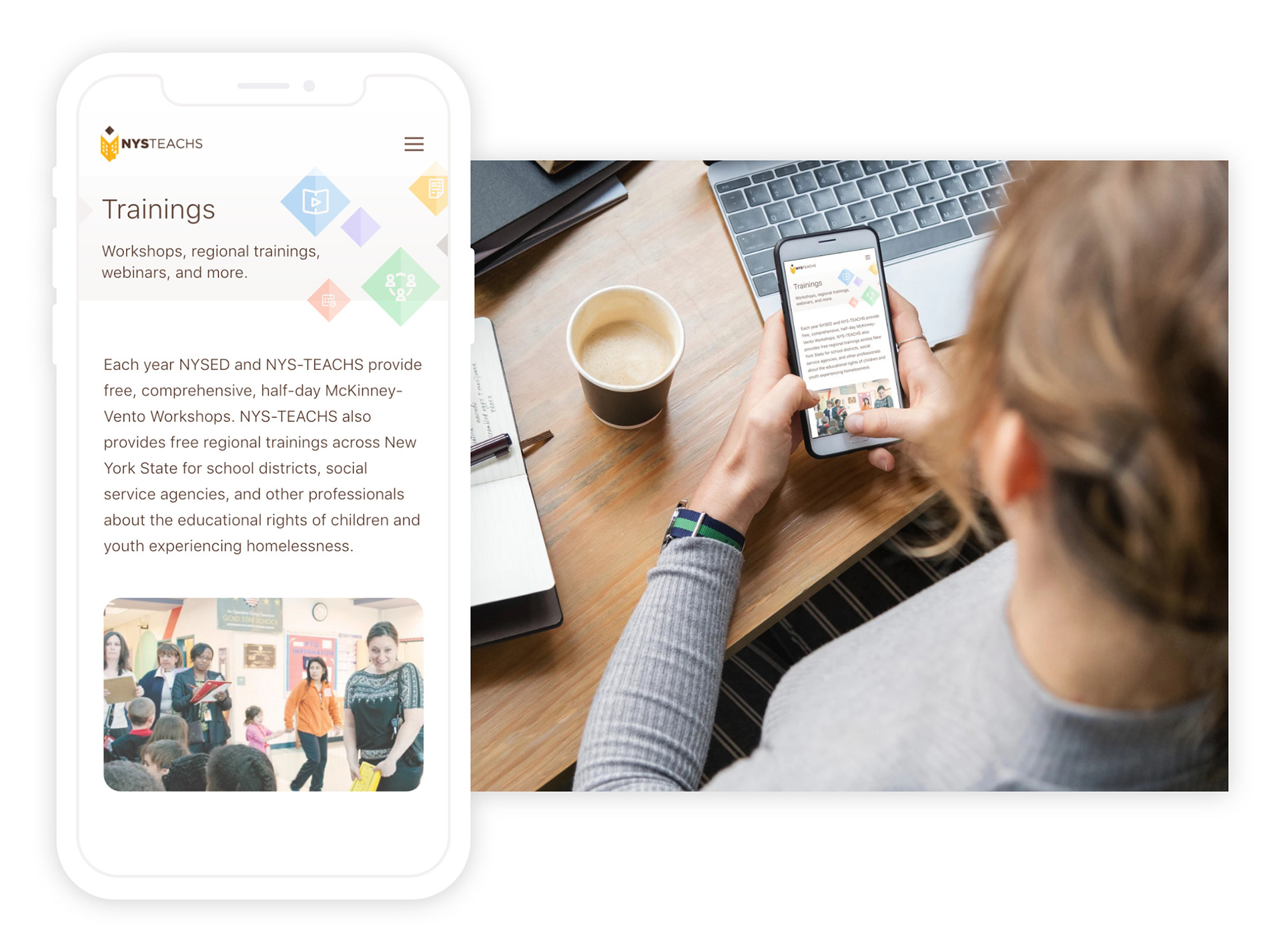
The redesign focused on usability and simplicity to mitigate confusion and get users the materials they need as efficiently as possible. To that end, I wanted to avoid an overly trendy or modern design, and instead highlight resource-finding functionalities like filtering, sorting, and searching. I also created a versatile, branded icon set that added some much needed vibrance to the site, illustrations and marketing materials.

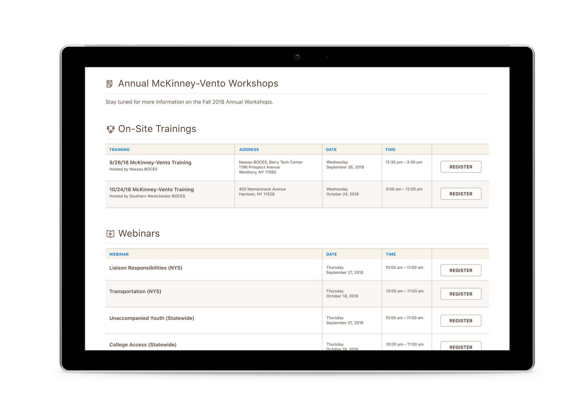
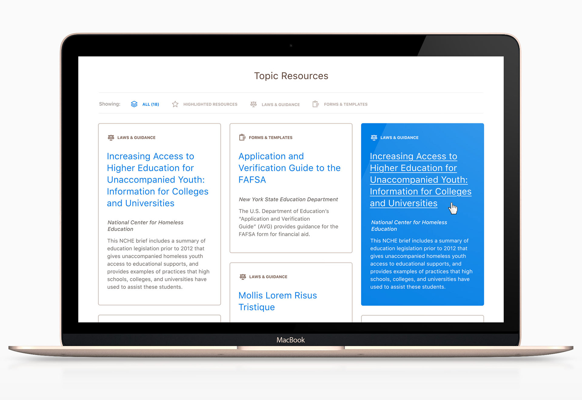
Resource Grid
An organized grid of resource cards, rich with details and filterable by simple category tags provided a clean, at-a-glance view of information for a user to digest. Rollovers and other interactions are kept bold and obvious.